YING LEI
(2020)
(↙)
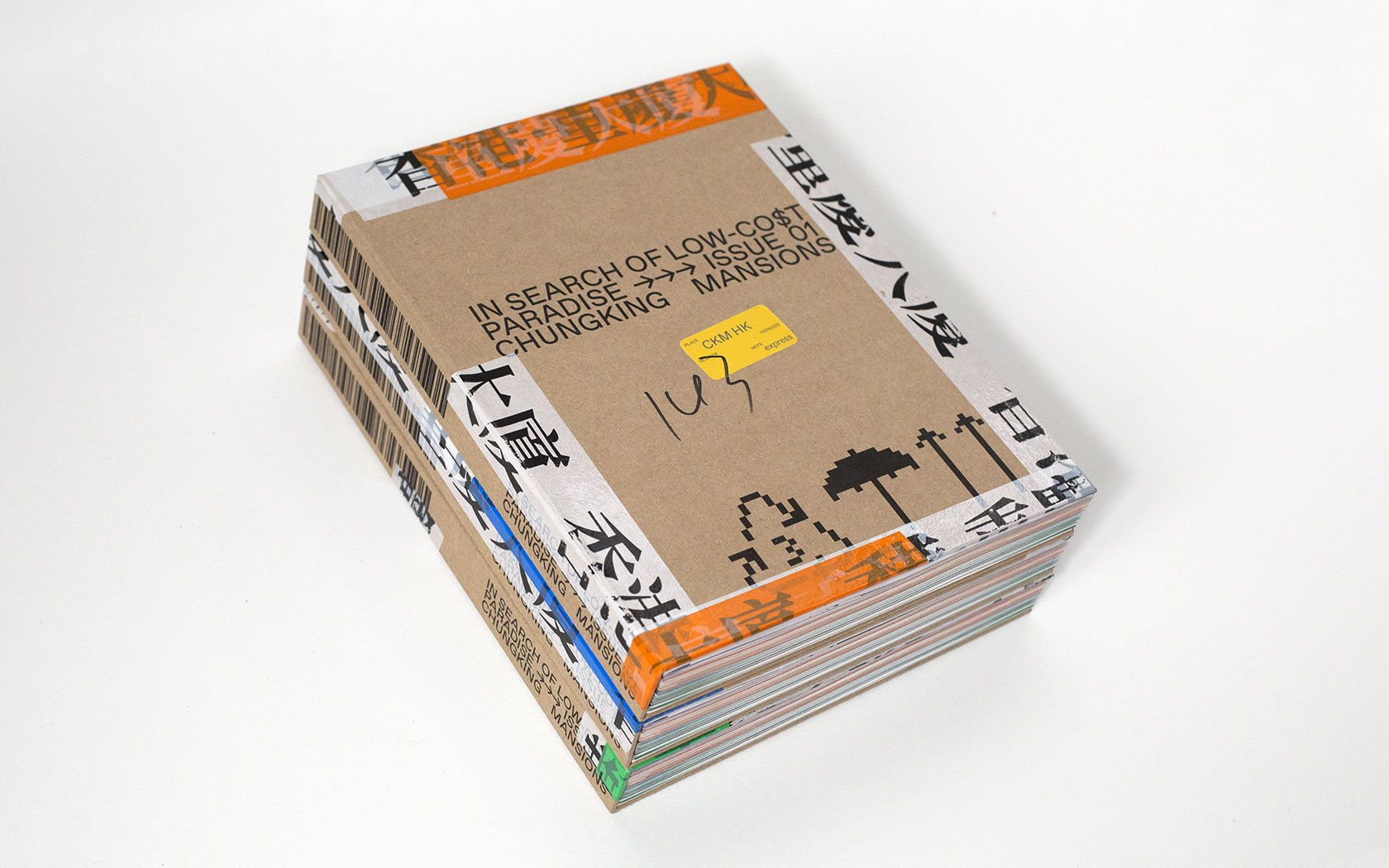
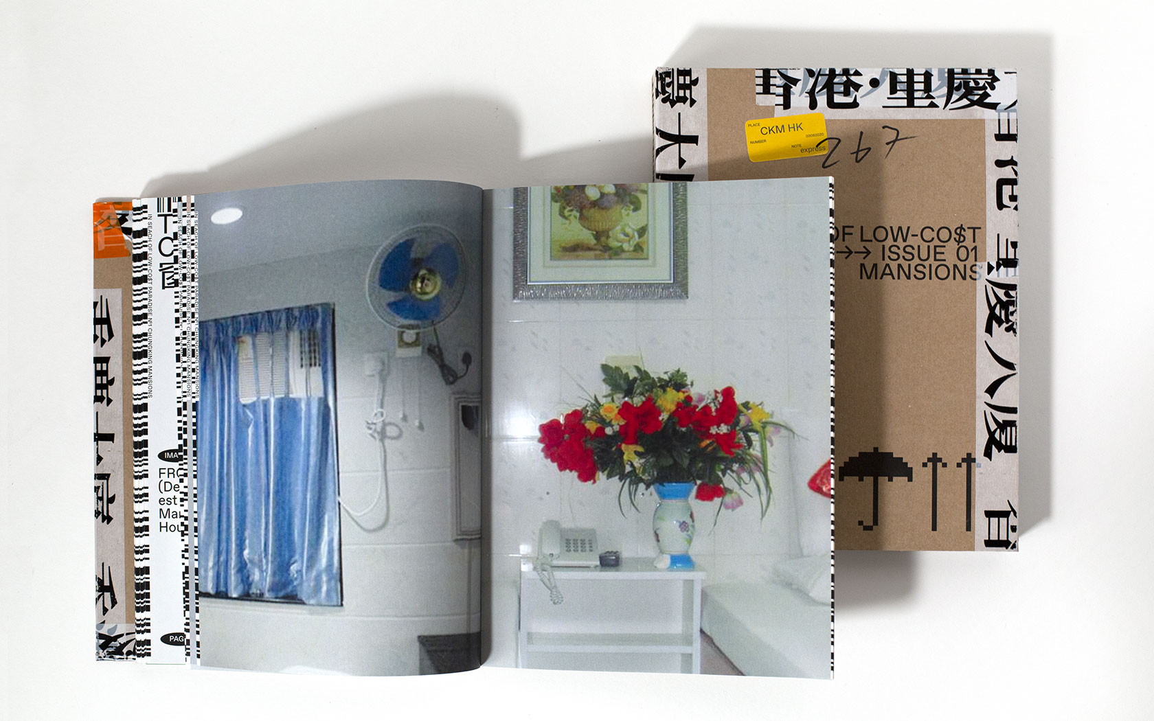
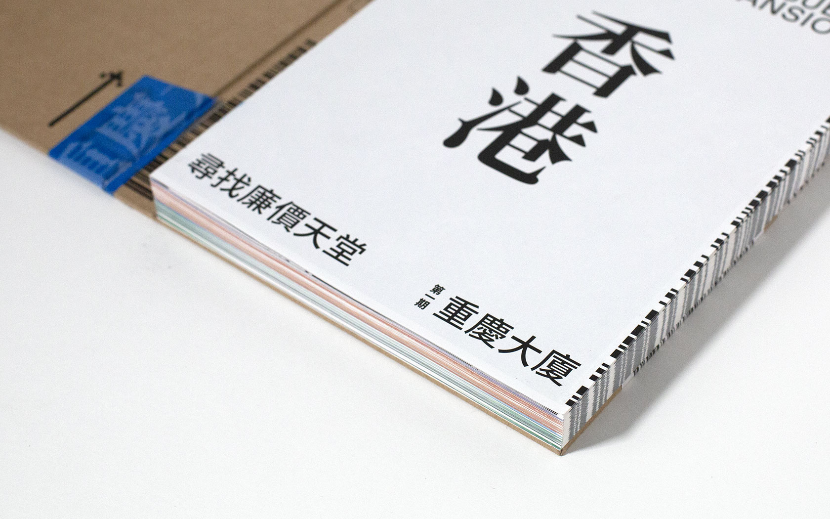
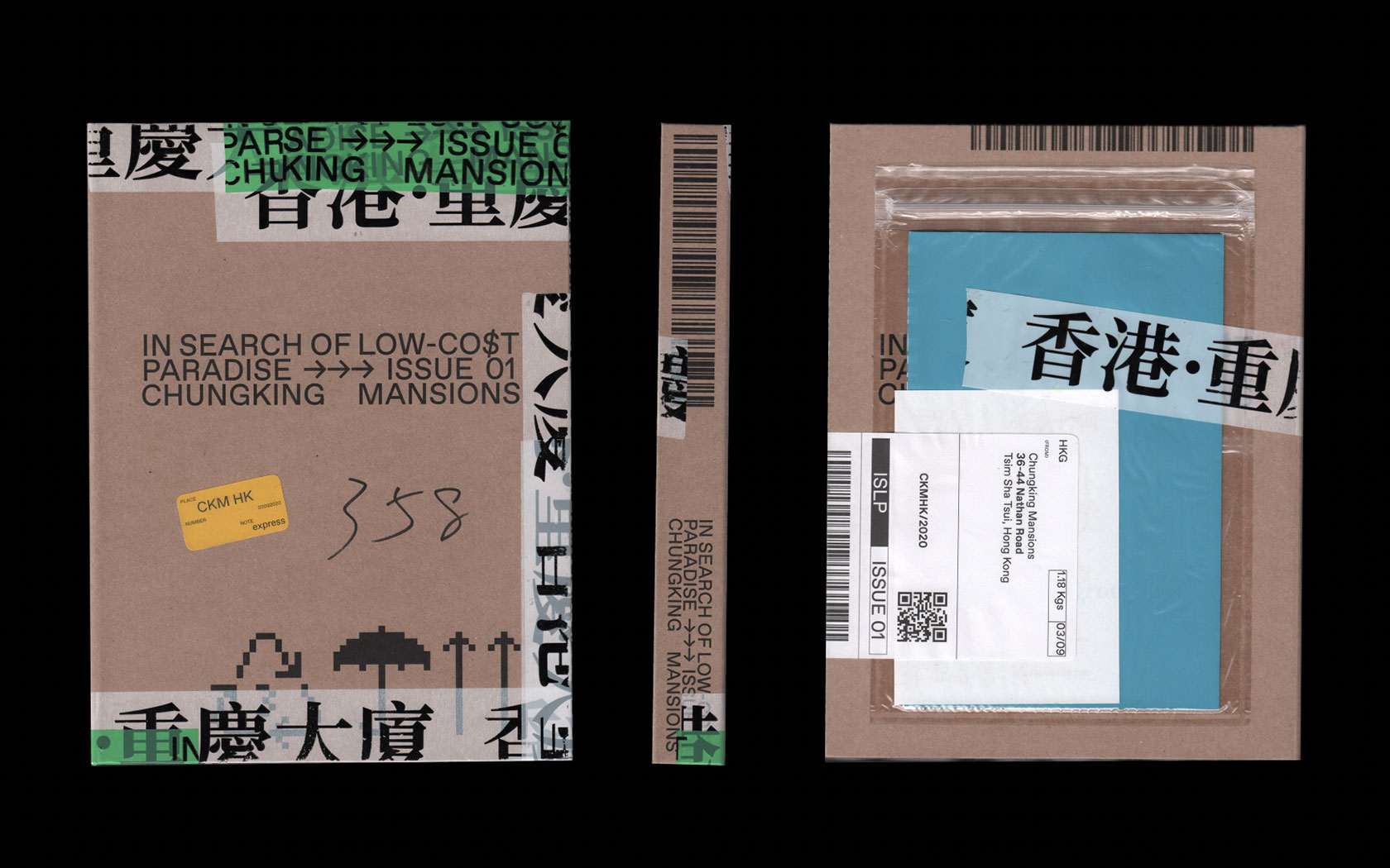
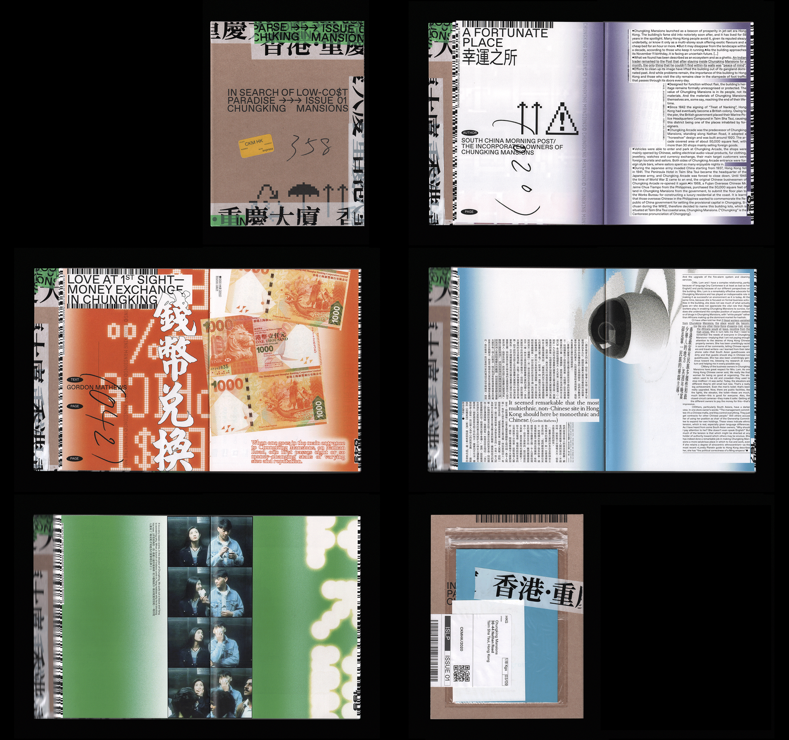
01 IN SEARCH OF LOW-COST PARADISE magazine and its unique digital platform present one ethnic enclave per issue. It aims to reveal what is going on behind these complex and contradictory neighbourhood doors. The first issue takes us on a journey to Chungking Mansions (CKM), a dilapidated 17-storey commercial and residential structure in the heart of Hong Kong.
(2019)
(↙)
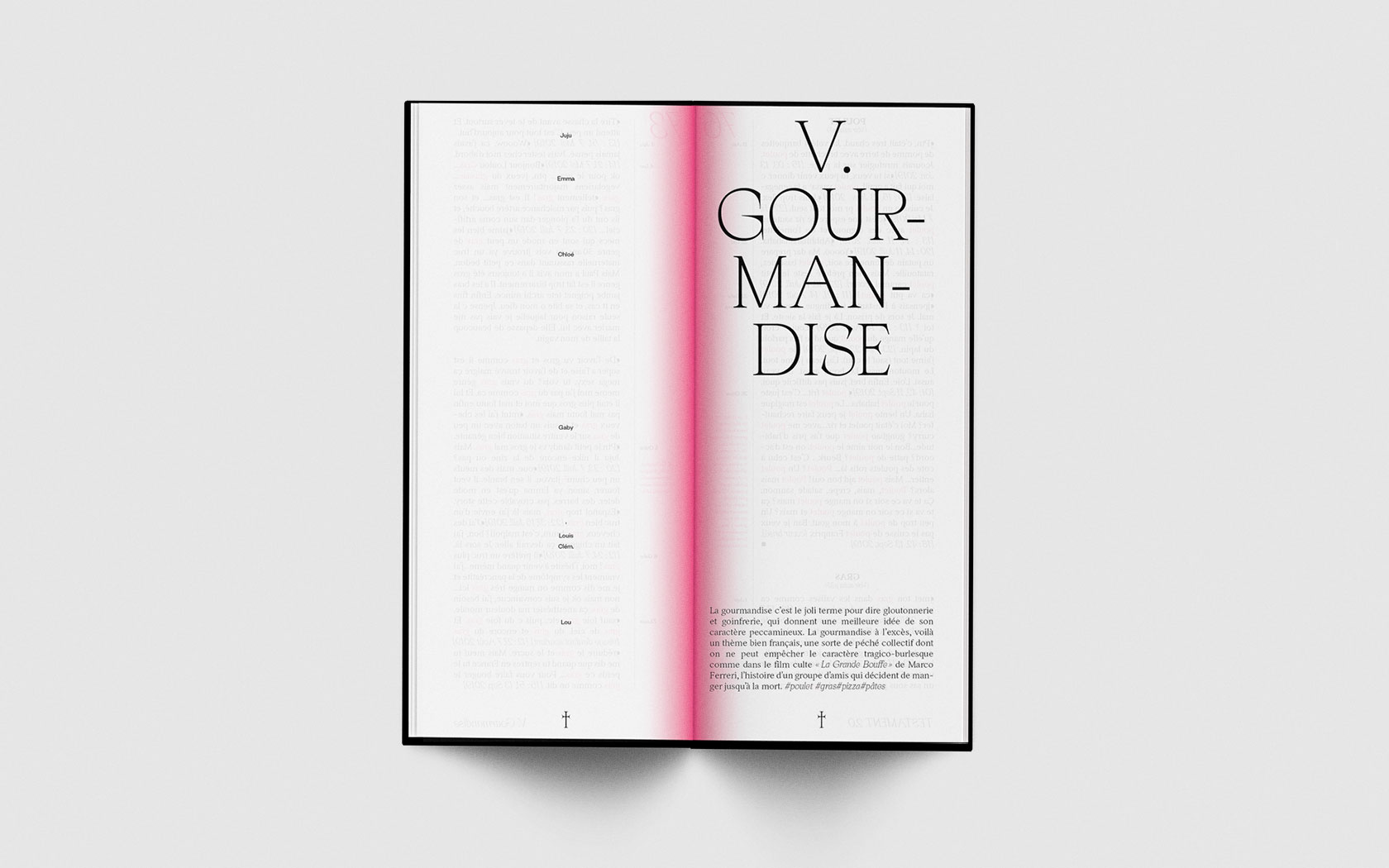
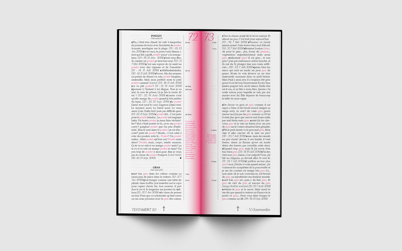
02 This project aims to stage meaningless instant messaging content through a biblical formatting and layout. These conversation fragments, organized by keywords, are a contemporary exploration of the seven deadly sins, constituting a very strange and absurd story.


(2020)
(↙)
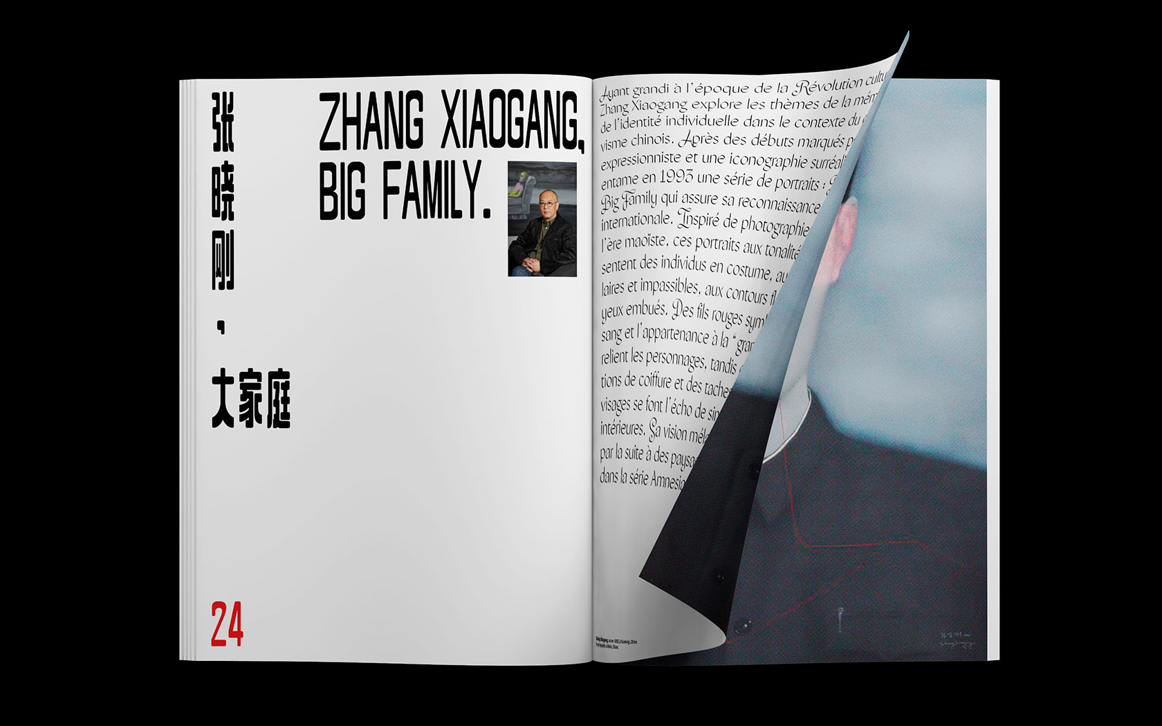
03 The magazine highlights the attachment of people to its cultural and social practices (family, territory, religion...), highlighting the theme aims to make cultures understand and make voices heard.



(2019)
(↙)
04 Rebranding project for the Andy Warhol Museum in Pennsylvania (USA). It is an assignment during my Erasmus Exchange Program at SVA (NYC). (Portfolio class with Paula Scher & Courtney Gooch at Pentagram NYC.) I created a new red and white logo, inspired by Warhol’s Campbell’s Soup Can, one of the most well-known images of American modern art. The logo system was enhanced by means of repetition, reminding visitors of Warhol’s work.


(2019)
(↙)
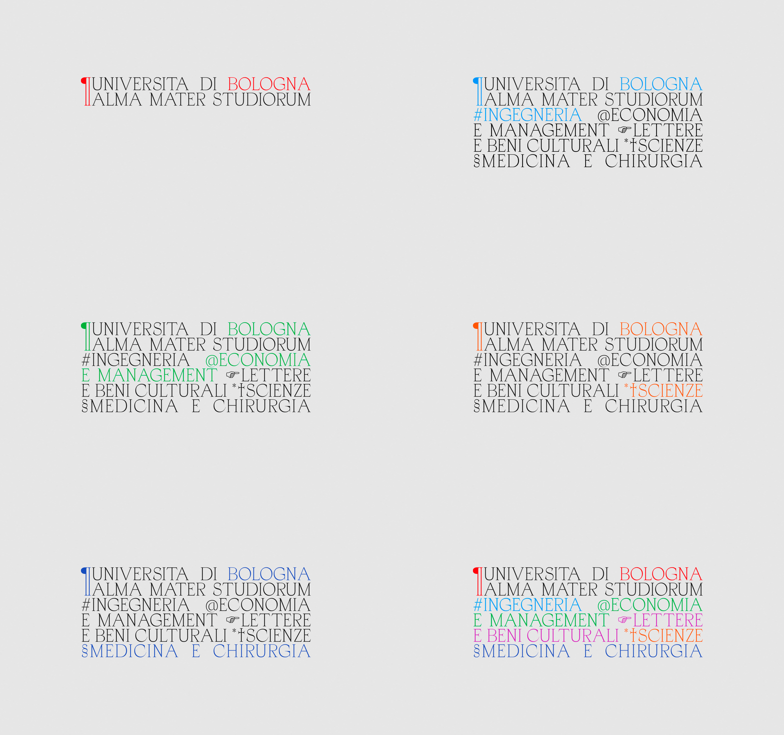
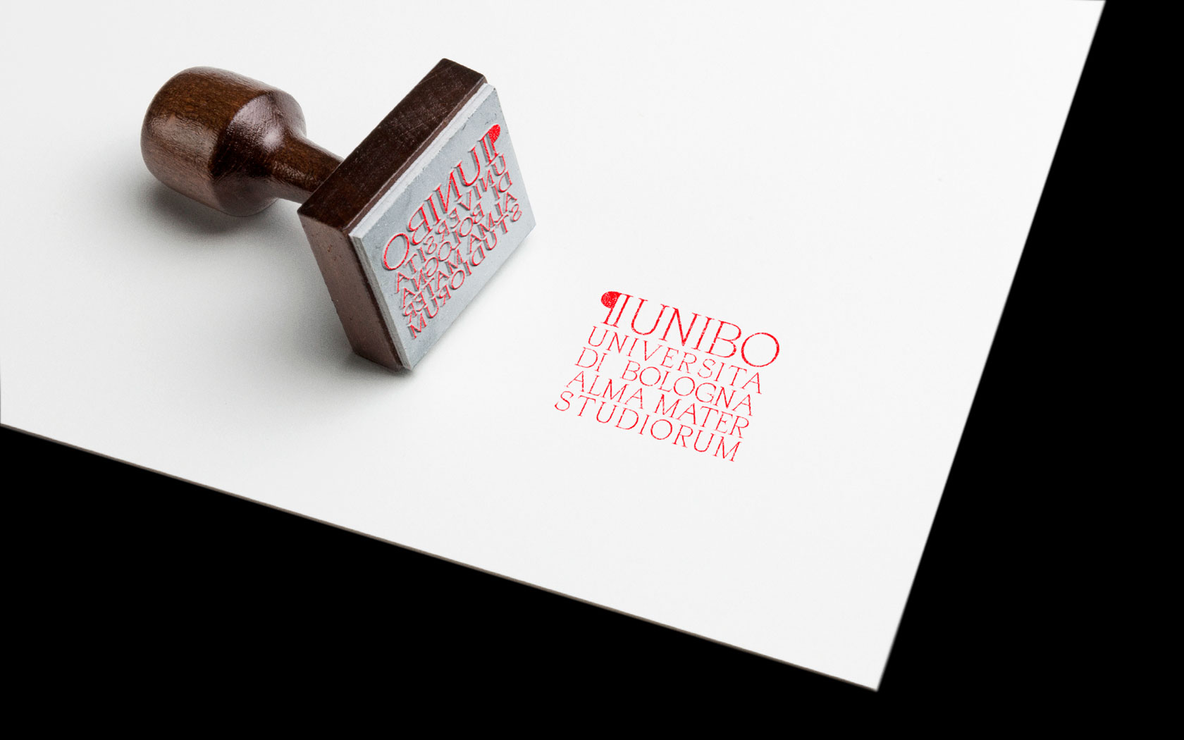
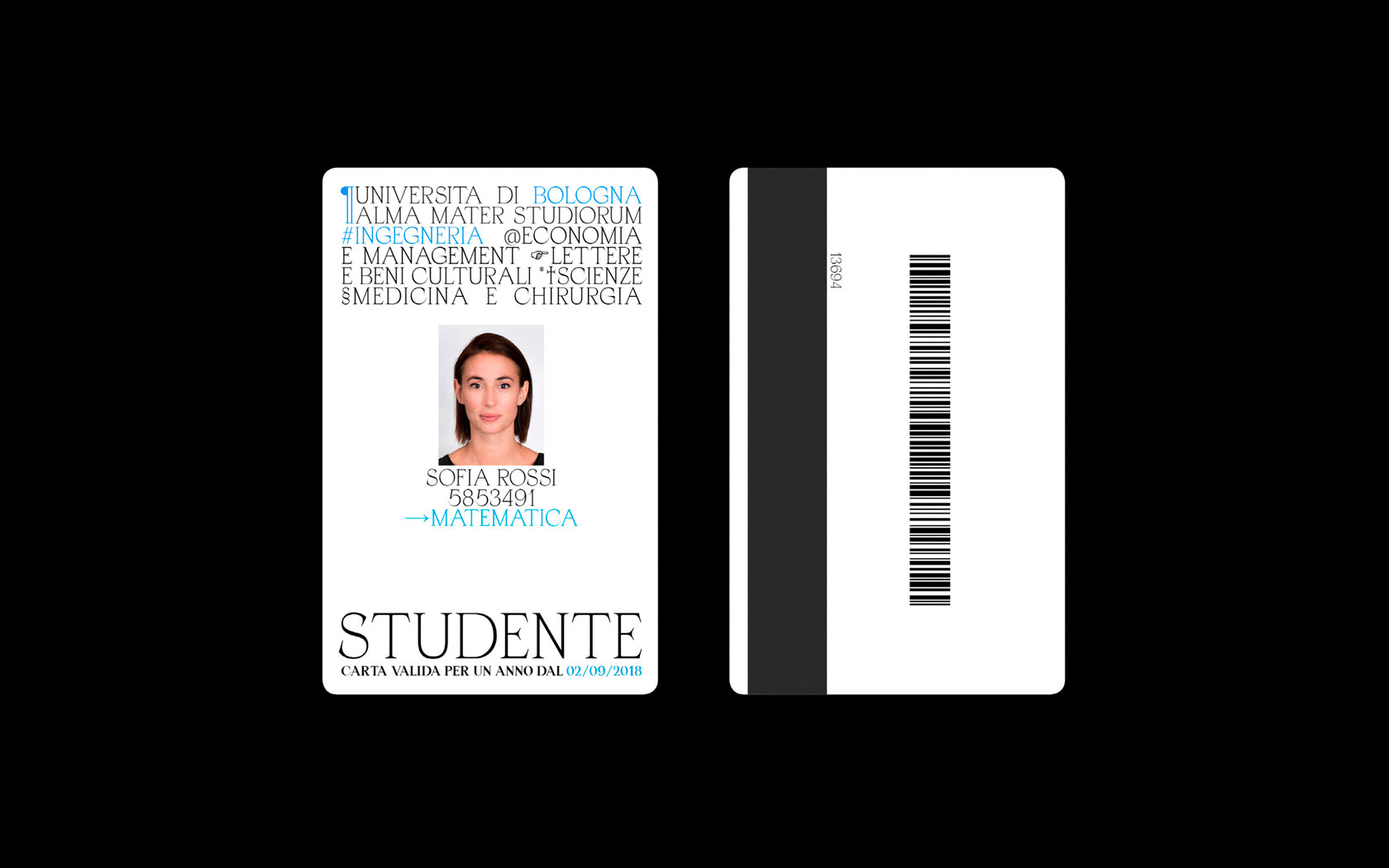
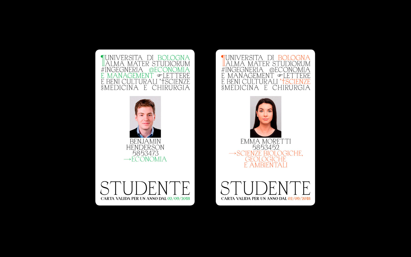
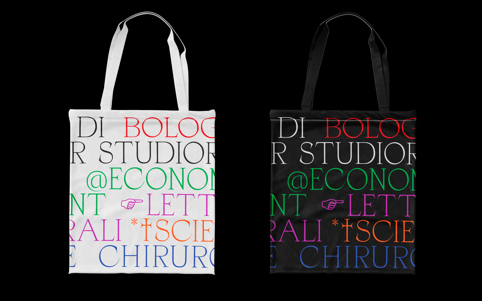
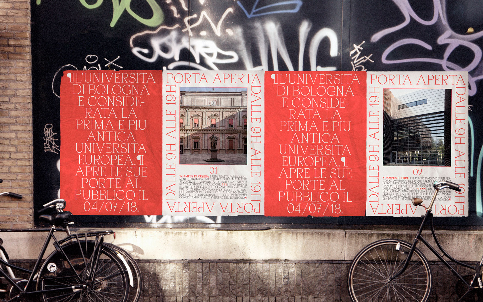
05 Creation of a new brand system for University of Bologna, located in Bologna in Italy. It is known as the oldest university in the world. The aim of my branding project is to portray its long history in a contemporary way. I used an Italian looked contemporary typeface, called Apoc, in the logo system inspired by the layout of stone inscriptions, enhancing the historical aspect of the university. Different colors and different symbols were applied to different schools, in order to facilitate the recognition of each school.



(2020)
(↙)
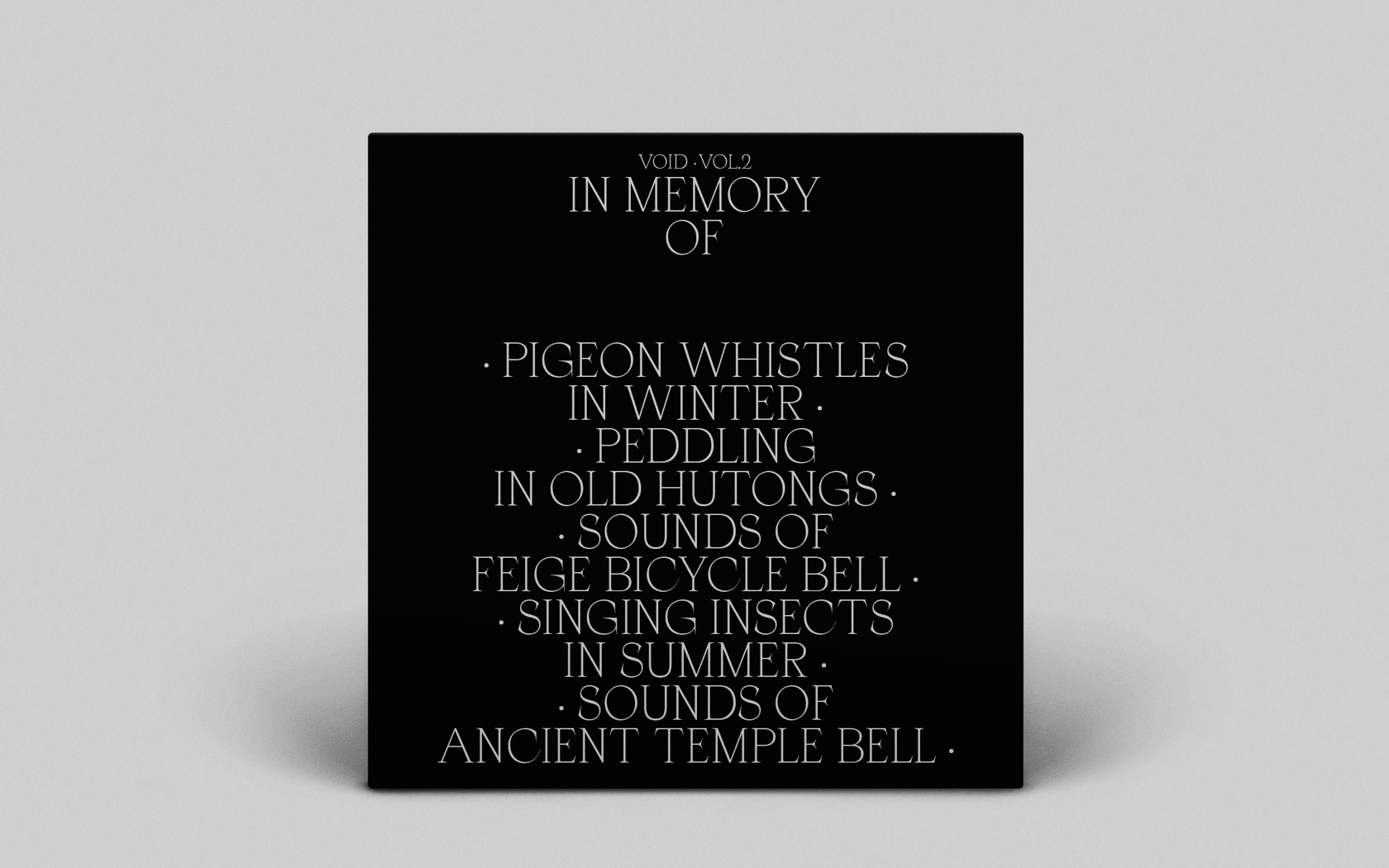
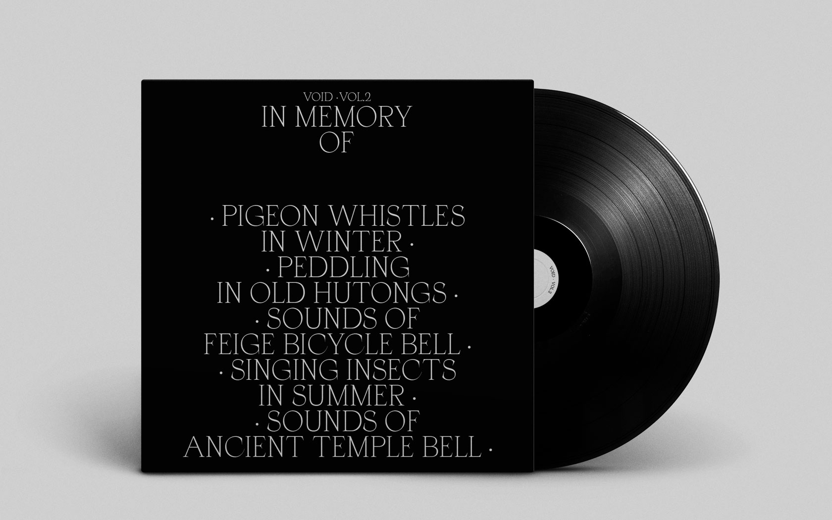
06 The disappearing sounds of old Beijing were used as raw materials for the sound design. The videos of modern Beijing were used in my clip to be in opposition to the sounds of old Beijing, aiming to make people feel the lack of something. The album cover design was inspired by tombstone inscriptions, inviting people to mourn these disappearing sounds.
(2018)
(↙)
07 A project in collaboration with interior design students of Penninghen. This project aims to create an editorial object and a website portraying the students’ project in Venice. Their project, Entre ombres et lumières (Between lights and shadows), is an installation to show the movement of shadows on Sant’Angelo square in Venice. To convey this idea in the book, we start with a dense layout (a lot of shadow) and finish with an airy layout (little shadow). The book contains two parts: the first part gives some historical background of Venice and its architecture; the second part present the students’ project. These parts are separated by a flip book in the middle of the book, showing an animation of the movement of shadows. The website brings together pictures and other kinds of documentation on the theme of lights & shadows. On the website, a mass of shadow passes from time to time, enhancing the theme of the project.

(2019)
(↙)
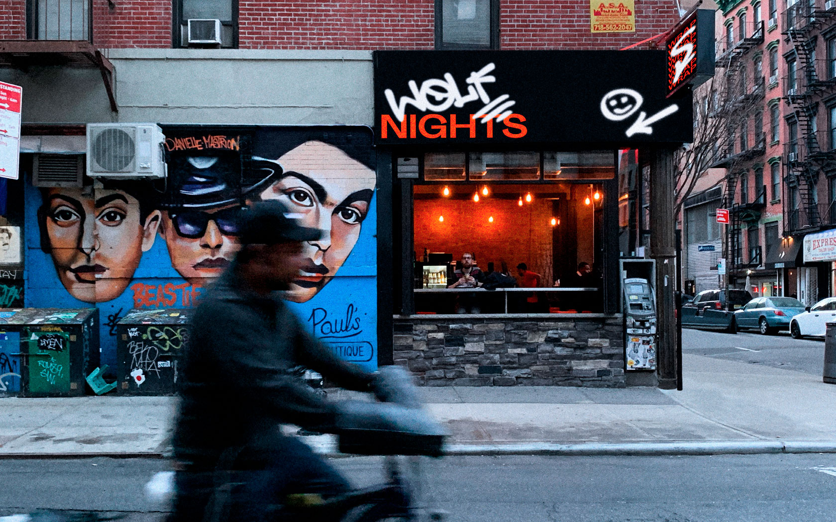
08 The objective of this project was to create a memorable visual identity for a fast food restaurant called Wolfnights. Graffiti was used as key element in order to convey the idea of urban streets, in keeping with the style of the restaurant. The unusual association of typography with graffiti aims to create a strong visual impact and to stand out in today’s competitive fast food market. The brand system is applied to various fields from the interior design of the res- taurant to printed materials and digital media.


(2019)
(↙)
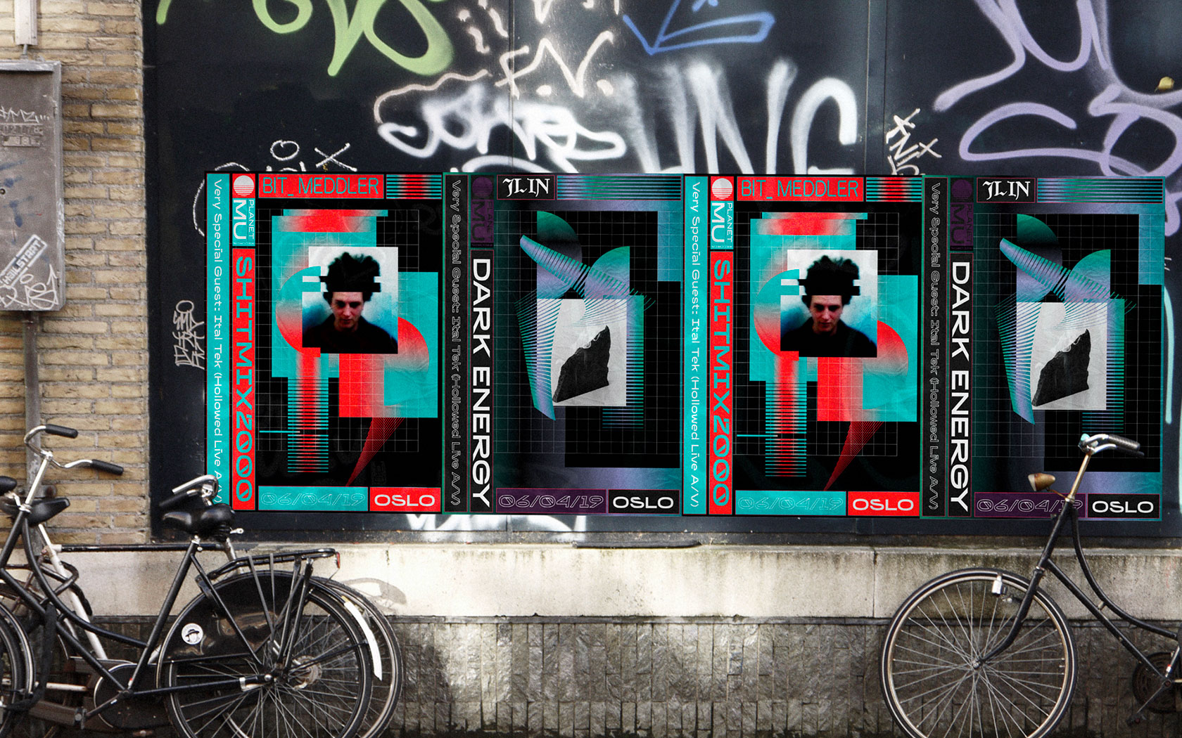
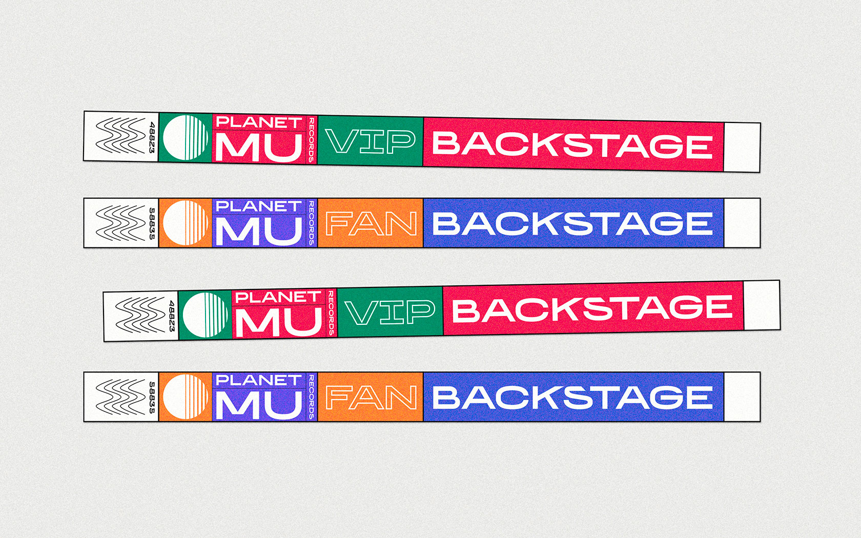
09 The aim of this project was to refresh the existing record label identity of Planet Mu Records. The new branding system was inspired by the retro 80’s VHS style, in keeping with the music videos style of the label. Each musician has its own typeface, giving each singer a different album style all in accordance with the overall consistency.


